
Building Scalable & Responsive Websites – My Development Philosophy
In today’s digital-first world, a website is more than just an online presence — it’s your business’s digital foundation. As a web developer, my focus has always been on building websites that are scalable, responsive, and ready to grow alongside your goals.
Why Scalability Matters
Whether you’re starting small or already managing a high-traffic site, scalability is key. I structure every project with future growth in mind:
-
Modular architecture: Easy to expand with new features.
-
Clean and optimized code: Reduces server load and enhances performance.
-
CMS integration (mostly WordPress): So clients can easily manage content as they scale.
Responsive Design: Not Just Mobile-Friendly — Mobile-First
Over 60% of traffic today comes from mobile devices. My development workflow includes:
-
Mobile-first CSS architecture
-
Fluid grids and flexible images
-
Testing across modern devices and browsers
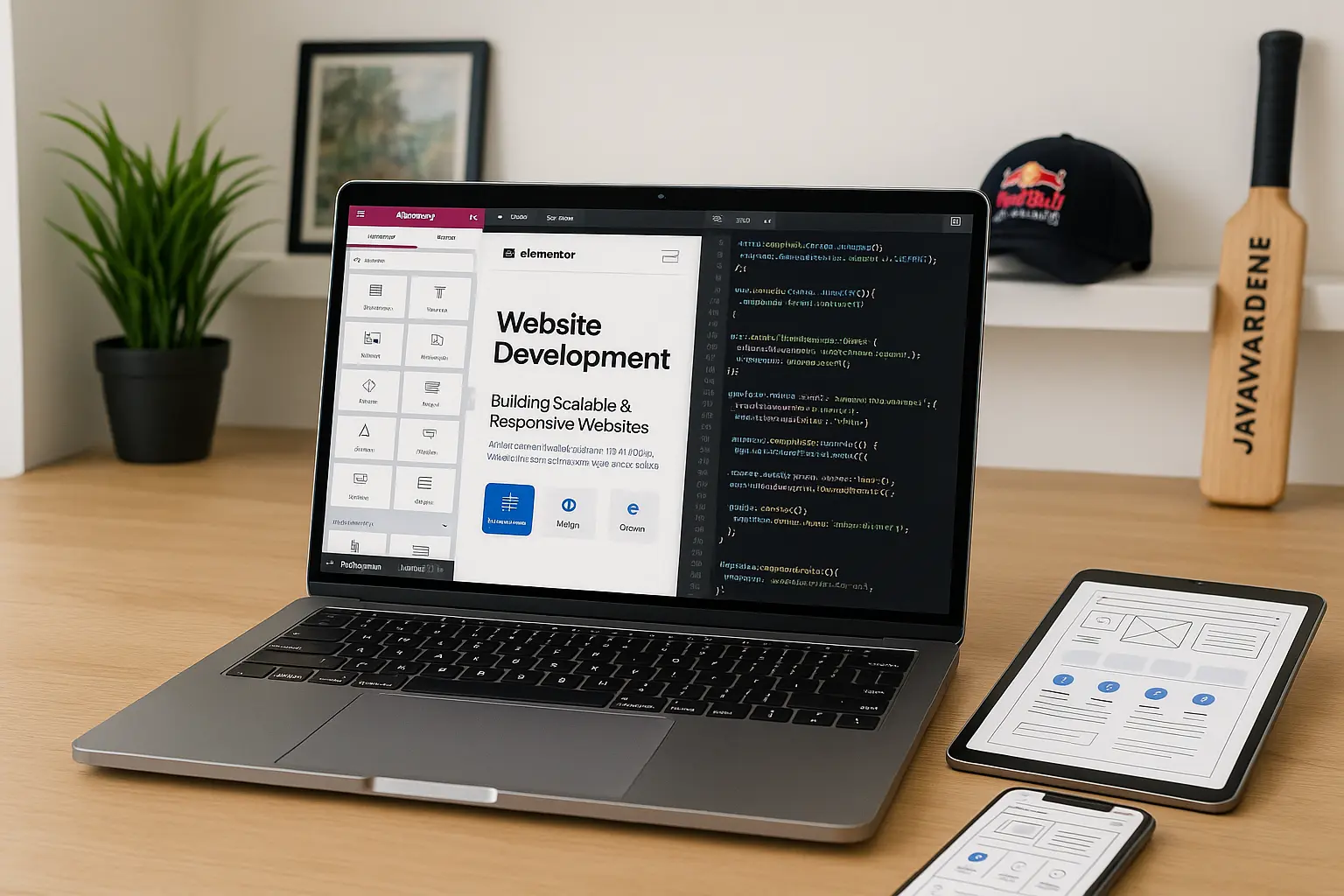
Tools & Technologies I Use
-
Front-end: HTML5, CSS3, JavaScript, Bootstrap, Tailwind
-
Back-end: PHP, WordPress CMS
-
Builder tools: Elementor, Bricks Builder (for advanced custom layouts)
-
Version Control: Git / GitHub
Real Client Example
Recently, I built a multi-language site for an education platform. Initially designed for Sri Lankan students, it later expanded to UAE and UK markets — thanks to the scalable WP Multisite setup I built from day one.
🧩 Conclusion:
A good website doesn’t just look great — it adapts, loads fast, and evolves. That’s what I aim to build with every project.